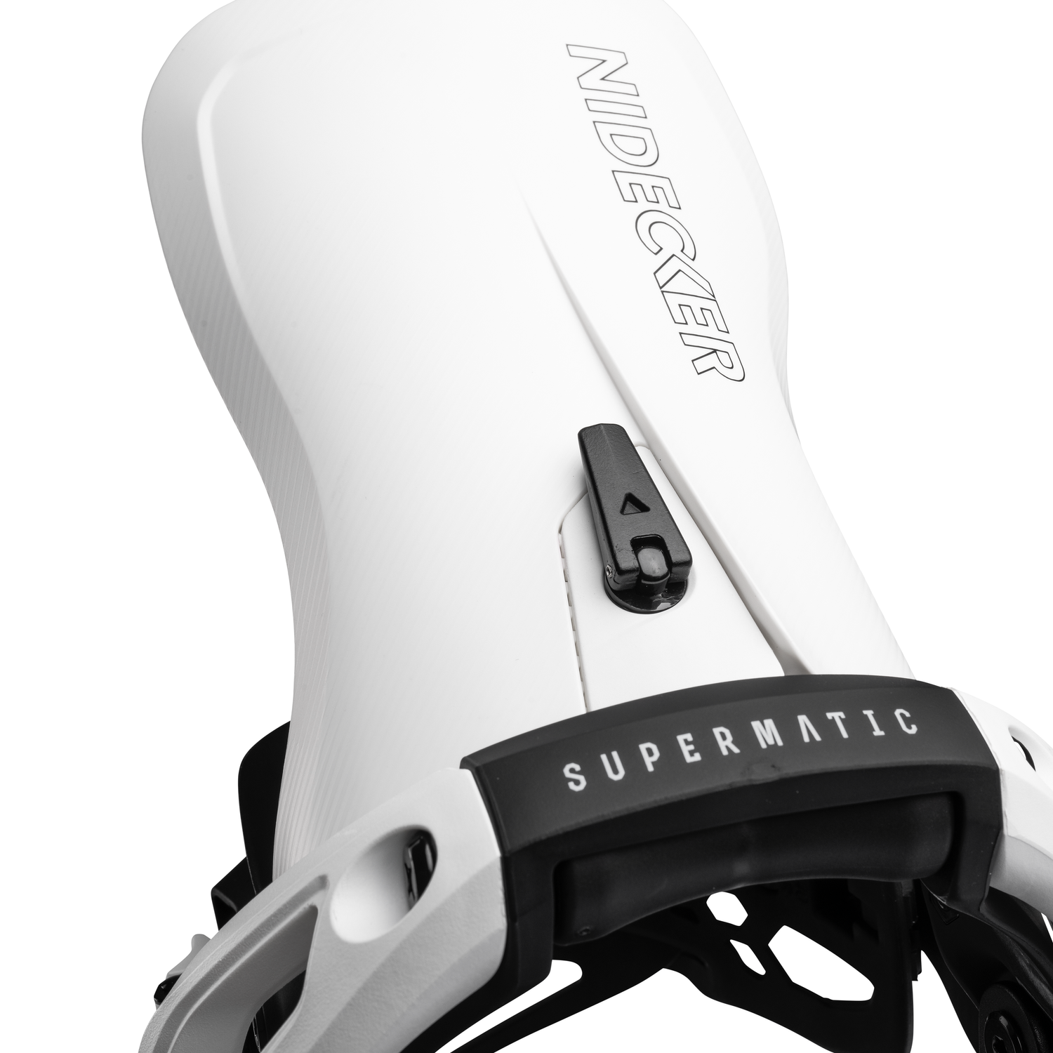
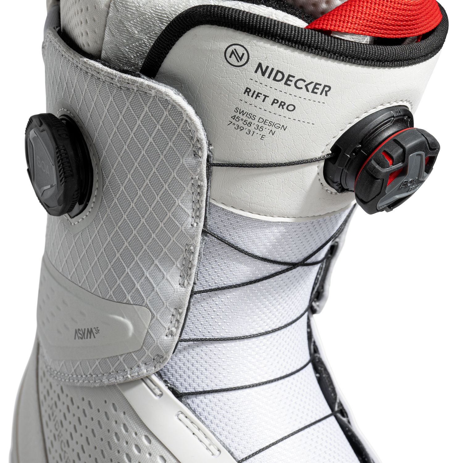
NIDECKER BRAND REFRESH
Evolved a 40-year narrative into alignment across product, identity and messaging as the brand scaled after rapid expansion.
CONTEXT
During a period of rapid international growth, Nidecker Snowboards’ visual identity and messaging had become fragmented across product, catalogues, campaigns and digital platforms.
Multiple taglines and shifting visual treatments diluted the clarity of the brand. A unified, long-term narrative framework was needed.
PROBLEM
How do you evolve a 40-year heritage brand without losing credibility?
How do you create cohesion across product graphics, communication and seasonal campaigns while maintaining commercial momentum?
STRATEGY
Rather than a single dramatic rebrand, we pursued a system-led evolution.
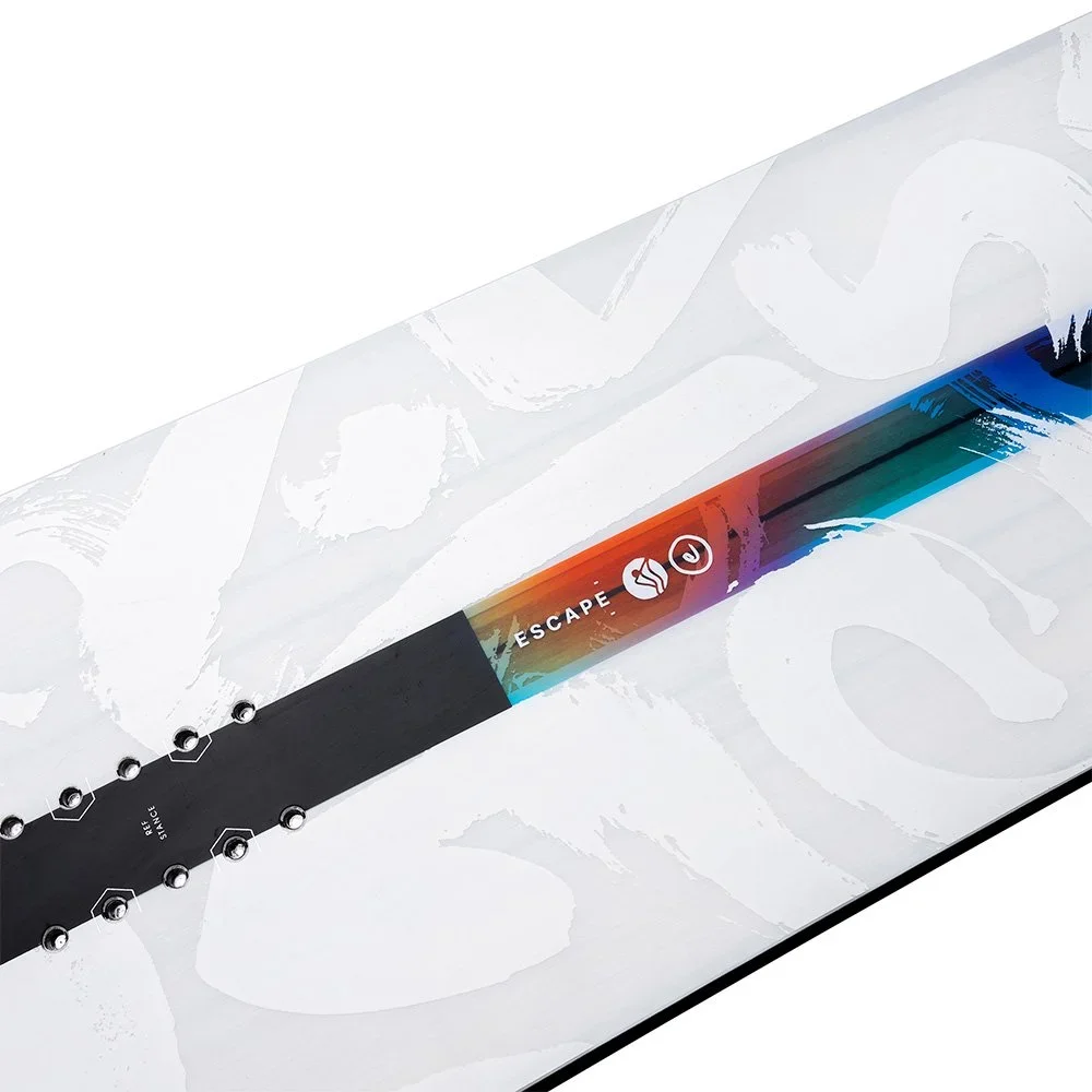
We clarified the brand’s core qualities - quality & innovation - rooted in its 40-year heritage.
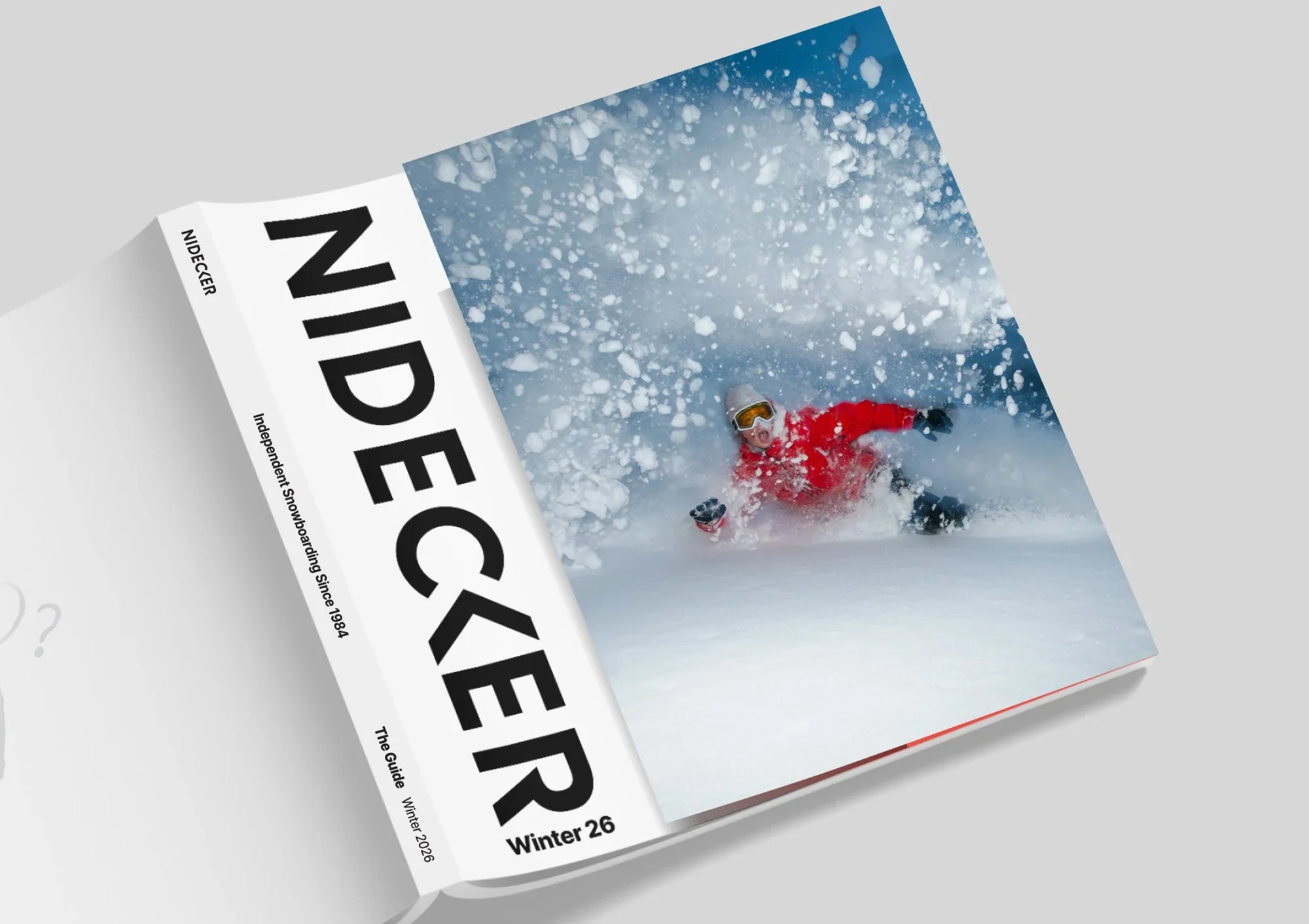
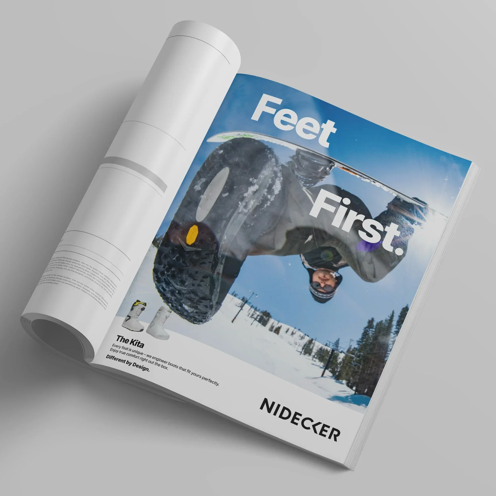
A new tagline, “Different by Design,” was introduced as a long-term positioning platform, anchoring communication in product innovation and Swiss engineering.
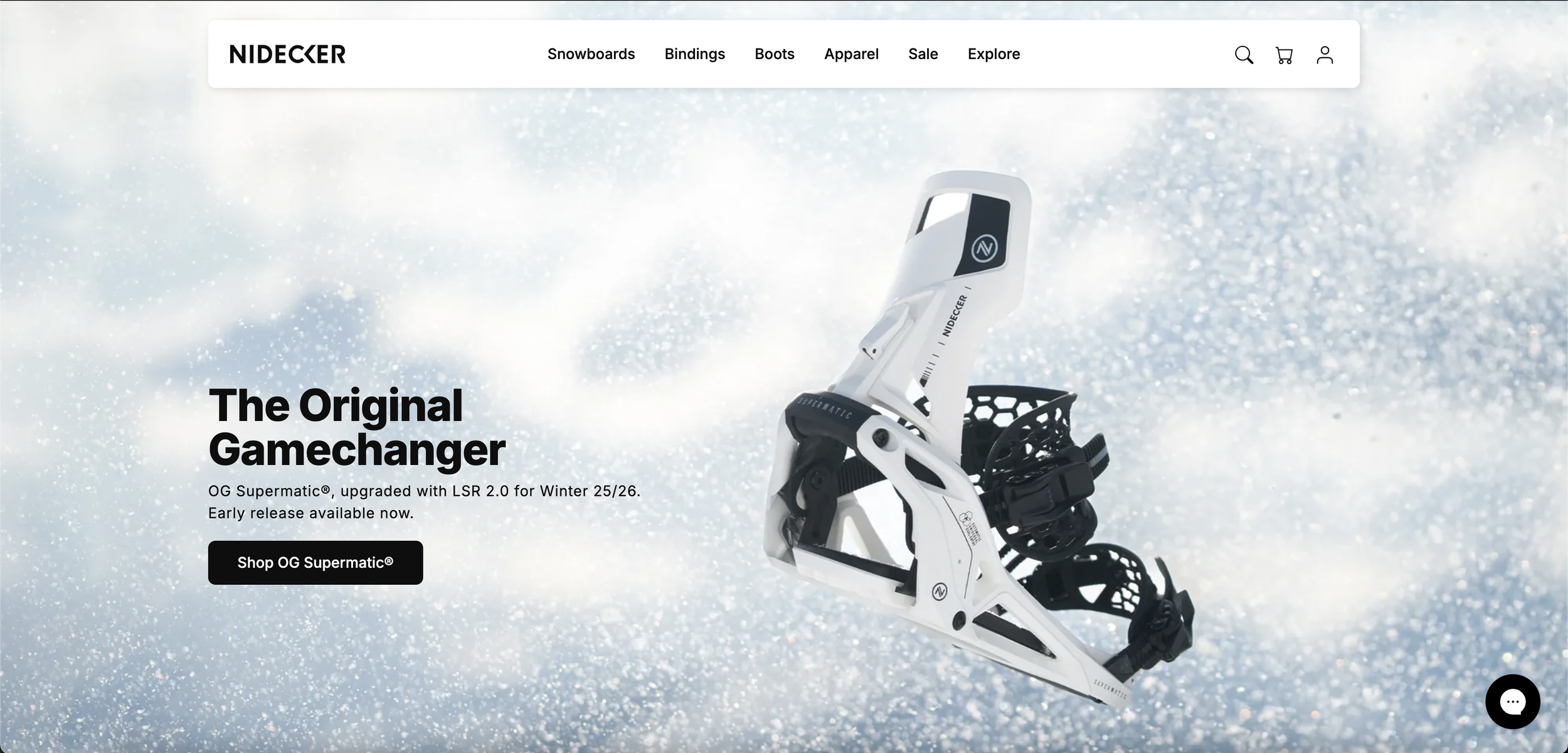
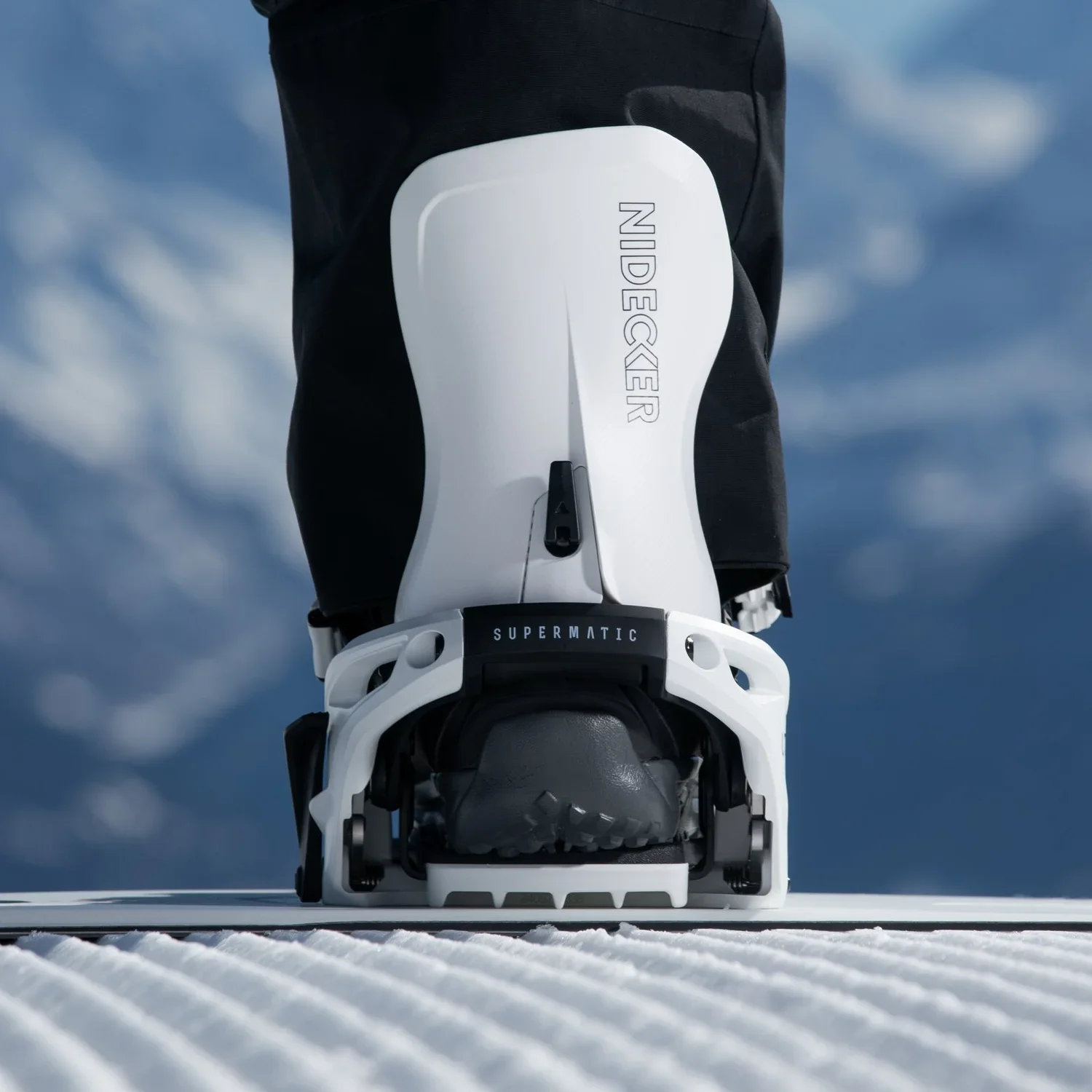
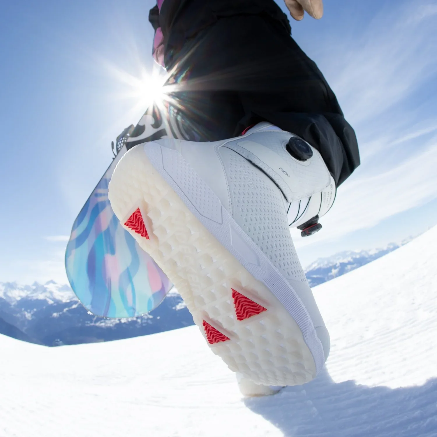
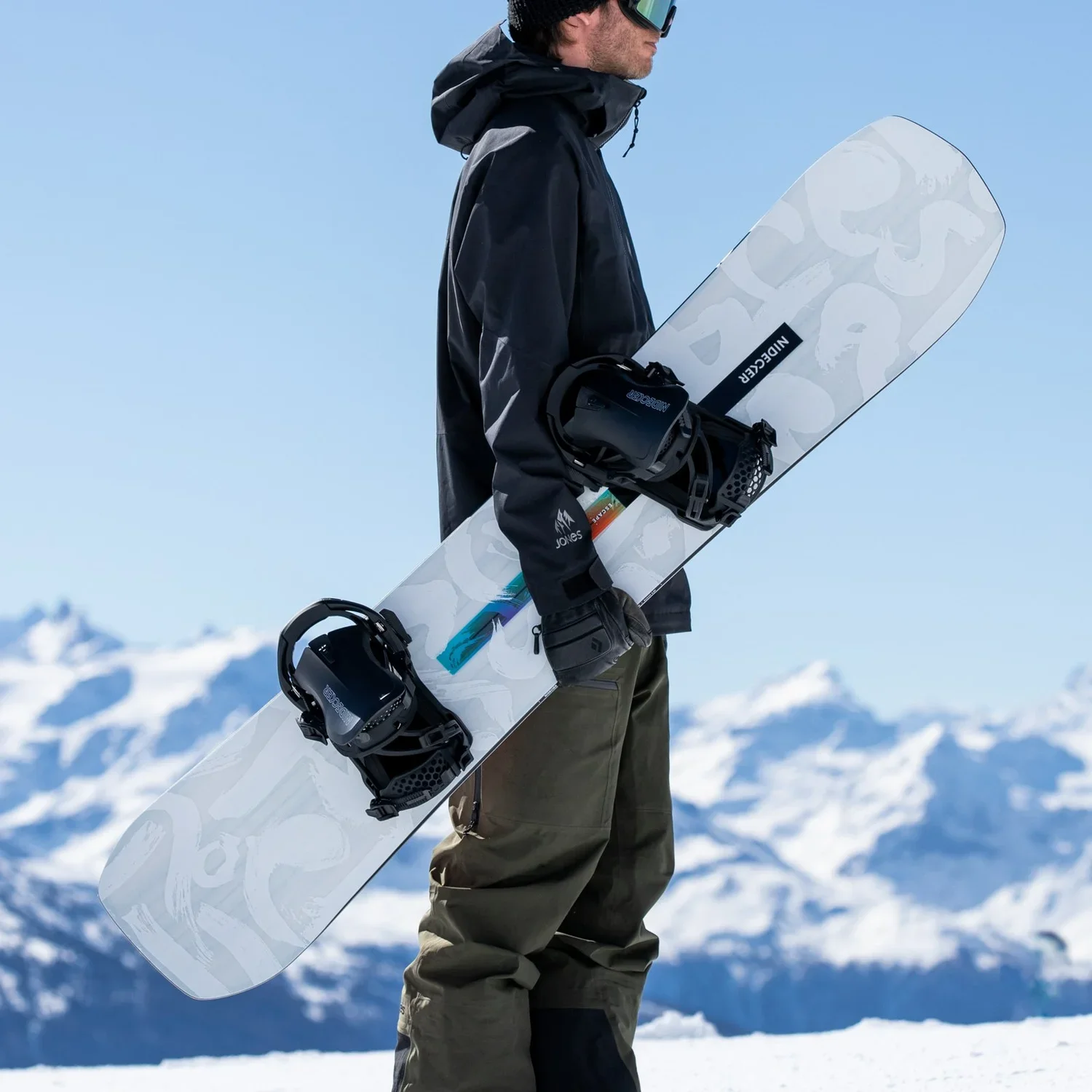
Typography, colour systems and tone of voice were unified across catalogue, website, campaigns and retail environments.
The objective was not visual novelty, but consistency and recognisability over time.
EXECUTION
I led the alignment of product storytelling, visual language and messaging across departments: creative, marketing, sales and product.
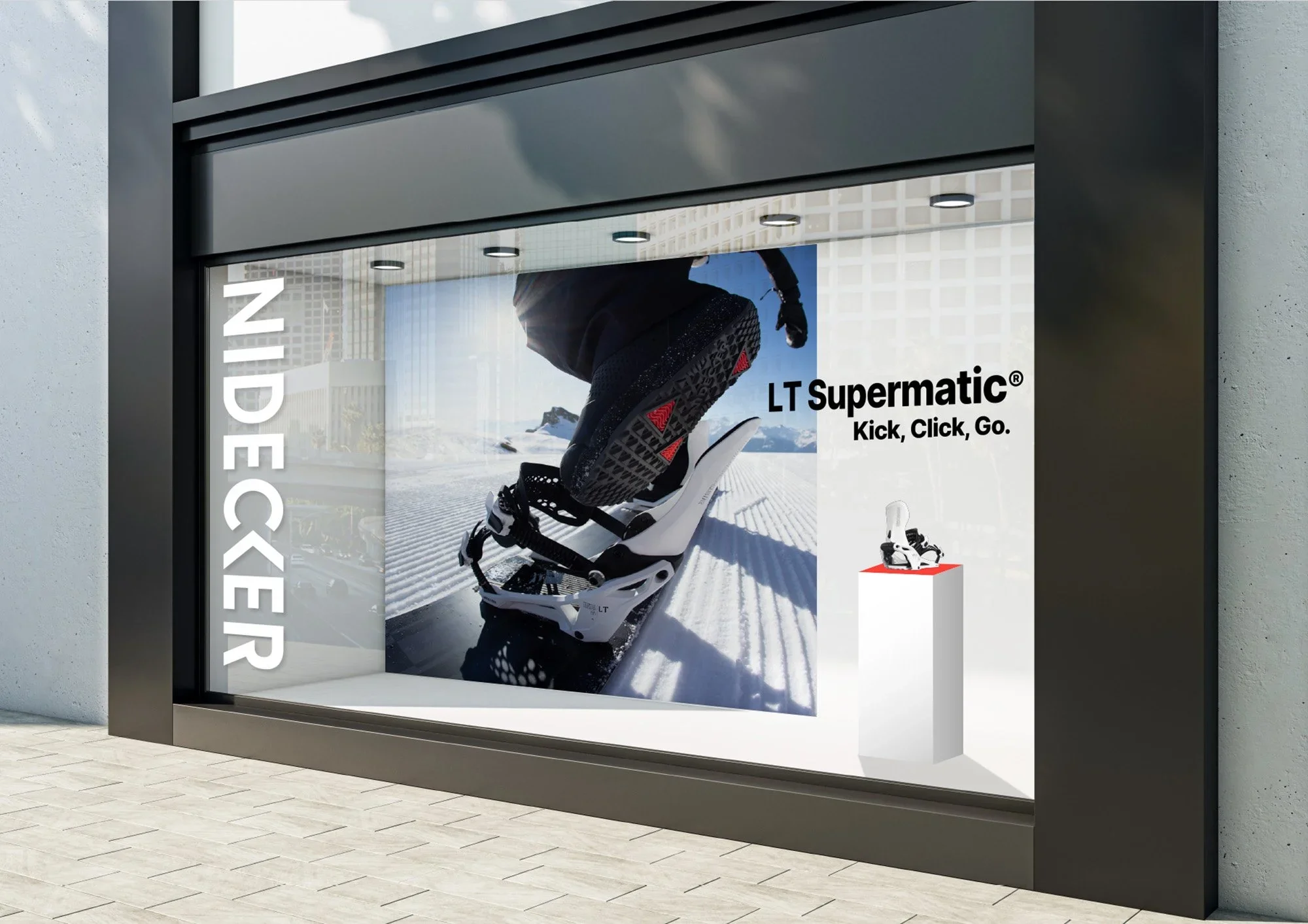
Seasonal campaigns were brought under a consistent tonal framework.
Internal creative processes were clarified to reduce overlap and maintain coherence as the team scaled.
OUTCOME
Product, messaging and campaigns were brought together under a systematic, long-term vision.
Cohesiveness was well received among network, e.g. global window campaigns increased by 4x.
Distributor feedback highlighted improved clarity in brand positioning.
Strengthened international market consistency during seasonal launches.